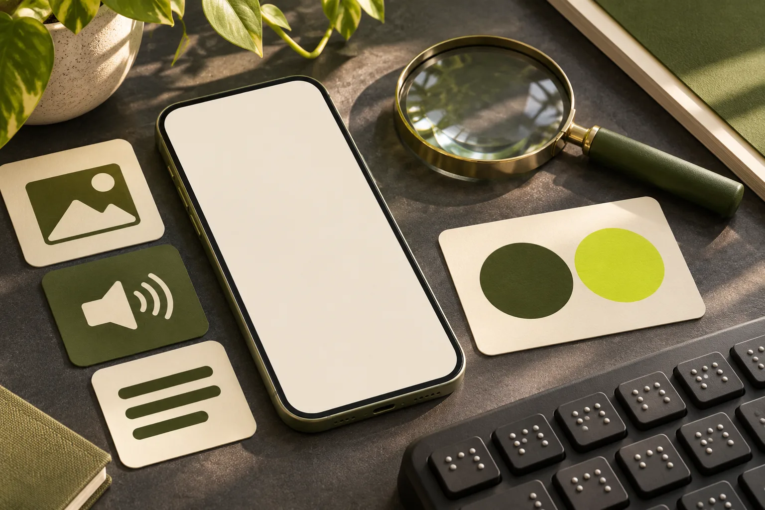
Begin with the information people need
An accessible post helps different people understand the message and act on it. Start by deciding what the reader needs to know: an event time, a service change, an answer to a question or a way to contact you. Put the important detail in the post rather than relying on a decorative image to carry it alone.
Accessibility is not a single setting or a promise that every platform works perfectly for everyone. It is a habit of reducing avoidable barriers: readable language, descriptions for meaningful images, captions for video and a destination that works when someone follows a link. Review the post in the format people will actually see.
Write for quick understanding
Use familiar words, short sentences and a clear first line. Replace internal abbreviations with terms a customer is likely to recognise, and explain a specialist term if it is necessary. Break a long caption into useful paragraphs. This helps readers scan on a phone and makes it easier to find the action without reading a dense block of text.
Avoid placing the essential instruction at the end of a string of hashtags or emojis. Give links descriptive surrounding context so someone understands where they lead. If a platform truncates longer text, check that the opening still makes sense and that important conditions are not hidden from casual view.
Describe meaningful images
When a photograph or graphic adds information, use the platform’s image-description field where available. Explain what matters for the post: for example, a photo of a level entrance may communicate access more usefully than a vague phrase such as ‘beautiful building’. Keep the description accurate and proportionate to the purpose of the picture.
If the image contains event details, put those details in the caption as well. Image descriptions complement readable post text; they should not become a list of search terms. A purely decorative image may not need a detailed description, but check the platform’s options and whether the image is carrying information a reader would otherwise miss.
An accessible post check
- MessageUse plain, direct wording
- VisualDescribe meaningful imagery
- FormatCheck contrast and readable type
- ReviewTest on a phone and with assistance
Make graphics and hashtags readable
Choose sufficient contrast between text and its background, allow room around words and test the design at its real display size. Avoid small type over a busy photograph. Do not rely on colour alone to explain a difference between items. A simple graphic that remains clear on a small screen is often more useful than a crowded design.
Use capital letters to separate words in a multiword hashtag, such as #LocalBusinessAdvice, and keep the number of tags manageable. Do not assume this resolves every screen-reader issue; test the post in context where possible. Use emojis sparingly and avoid replacing essential words with symbols that might be announced differently by assistive technology.
Provide alternatives for moving content
Add accurate captions to speech in a video and identify important sounds where relevant. Automatic captions can be a starting point, but review names, punctuation and meaning before publishing. If a visual demonstration communicates something not clear from the audio, describe the essential visual information in the audio or provide a suitable alternative.
Keep an accessible route to the information outside a platform whenever practical. A short social clip can link to a written guide or event page containing the full details. Check the destination on a phone and with a keyboard; a well-described post loses much of its value if the next step is inaccessible.
Test with the tools available
Open the draft at the size a customer will see. Ask someone unfamiliar with the business to identify the main point and the next step without an explanation. Where feasible, try a screen reader or ask a person who uses assistive technology to review the real post and pay them for their time where appropriate.
Write down barriers and prioritise a manageable fix. The exact controls for captions and image descriptions vary by platform and can change, so verify the current publishing interface. Keep an accessible plain-text version of essential information available if the platform does not offer a suitable control.
Example: an open studio announcement
Imagine a Hertfordshire studio announcing an open day. The caption states the date, time, address, access arrangements and where to find further details. A photograph shows the entrance, with alternative text describing the relevant route rather than repeating the studio name. A simple poster graphic uses large, high-contrast type and the same practical information appears in the caption.
The team checks the destination page, keyboard navigation and whether the contact route for access questions is monitored. This example is illustrative. It shows the value of planning content and accessibility together rather than adding a description as the last step before publishing.
Check the whole route with a practical task
Choose a task that matches the post: for an event, ask a colleague to find the date, access information and booking route; for a service update, ask them to identify what has changed and where to ask a question. Give them the published draft on a phone without explaining the design. Their hesitation may reveal an unclear label or a missing detail that is easy to fix.
Next, check whether the same information remains available when an image cannot be seen or a video is muted. This quick check does not replace testing with disabled users or a formal accessibility assessment, but it can identify obvious gaps. Ask for feedback from people using different devices and assistive technology rather than assuming that your own settings represent everyone.
Make the result actionable: record the particular barrier, the affected post and the person who can change it. If a platform cannot provide a necessary feature, put the equivalent information on an accessible page and link to it. Recheck the route after the platform or the event details change.
Create a repeatable final check
Before publishing, ask whether the main message is in text, meaningful images have appropriate descriptions, video speech has checked captions, and the colour and type are easy to distinguish. Read hashtags aloud or test them with assistive technology. Follow the link and check the destination rather than stopping at the post itself.
Record any platform limitation and choose an alternative route where needed. Accessibility improves through ongoing feedback and testing with real tasks. A simple checklist used consistently is more useful than a one-off declaration that every person will have the same experience.