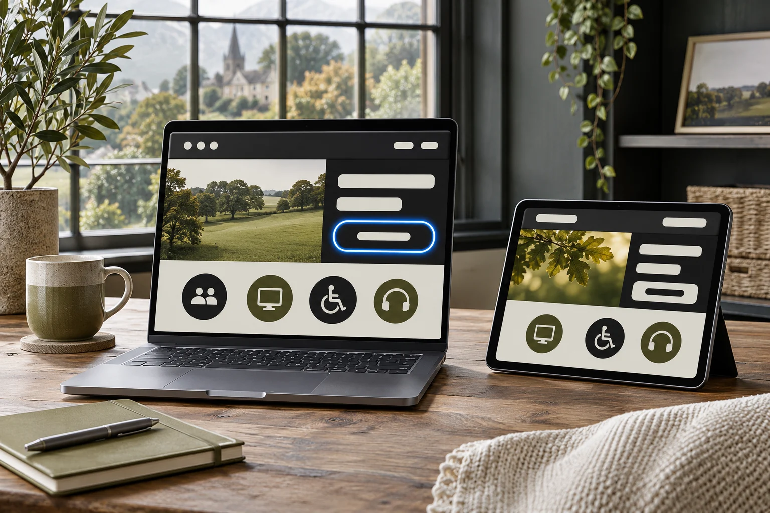
Accessibility starts with real tasks
A website is easier to use when people can find information, understand it and act using different devices and ways of interacting. Start by choosing important journeys: find a service, read its details, complete an enquiry and locate contact information. Test each on a phone and a larger screen.
These checks are a starting point, not an accessibility certification or a complete legal assessment. People have different access needs, and automated tools cannot identify every barrier. Where possible, involve people with relevant lived experience and arrange a more detailed review for critical journeys.
Make text easier to read
Use clear headings, short paragraphs and language that suits your audience. Choose text colours with sufficient contrast against their actual backgrounds, including buttons and text placed over photographs. Do not rely on colour alone to distinguish a warning, a link or a required field.
Check that content can be enlarged without words overlapping, controls disappearing or a user having to scroll in two directions to read ordinary paragraphs. Avoid setting important instructions only inside a pale placeholder that vanishes as soon as someone types.
Try the keyboard journey
Without using a mouse, move through the page with the Tab key. Can you reach navigation, buttons, links and form controls in a sensible order? Is the focused item visibly indicated? Can you open and close menus or other controls without becoming trapped? Follow through the whole task, not just the first screen.
Use meaningful link text that describes the destination. Several links labelled only 'click here' become confusing when read out of context. Check that buttons perform actions and links lead to destinations, and make clear if a link opens another window or tab.
Help people complete forms
Give every field a persistent, descriptive label and clearly indicate which information is required. Ask only for details needed for the enquiry. Provide useful error messages near the relevant fields and explain how to correct a problem, rather than merely changing a border colour.
Test the form with an empty required field, an incorrectly formatted email address and a successful test submission once a delivery service is connected. Make confirmation or failure messages clear. A person should not have to guess whether a message was received or type all their details again after an error.
Treat images and media thoughtfully
For an informative image, write alternative text that communicates the information relevant to the page. A photograph showing the difference between two materials may need an explanation; a purely decorative texture can often have empty alternative text. Do not use a filename as a substitute for a meaningful description.
Do not put essential information only inside an image. For video, consider captions and an accessible alternative where appropriate, and make sure controls can be used by keyboard. If an embedded map is difficult to navigate, also provide the address and directions as text.
A short test a team can repeat
Choose a common task, such as finding a service and sending an enquiry. Starting on the homepage, navigate using only a keyboard. Write down each point where the focus is invisible, a control cannot be reached or instructions are unclear. Repeat the journey at a larger text size and on a phone.
Then inspect a form without submitting a real customer's details. Are labels still present after an entry is made? Does the error explain which field needs attention? If the submission succeeds, is a confirmation shown; if it fails, does the visitor know what to do? Only perform a live test when it is authorised and the recipient knows it is a test.
Record the page address, browser, device, steps and expected result for each issue. Fixing the navigation on a single template may improve many pages, but recheck representative examples after the change. This quick routine does not replace specialist testing or a complete audit.
If a problem cannot be resolved immediately, provide an accessible route to the same information or service where possible and make that route easy to find. Record who owns the issue and when it will be reviewed. An alternative is not a reason to stop fixing the original barrier; it is a practical way to support people while the work is underway.
Turn findings into manageable improvements
Select a representative set of pages, including a service, contact, homepage and any booking or payment journey. Record the problem, the page, how you found it, its effect and who can address it. Prioritise barriers that prevent people completing important tasks, while retaining a record of less urgent issues.
Recheck after changing the theme, adding a plugin or introducing a new form. Automated scanners and browser tools can help identify some issues, but a clean scan does not demonstrate that everyone can use the site. Accessibility is an ongoing part of content and website care.