Define a useful enquiry
A contact form is successful when it helps the visitor explain what they need and gives your team enough information to respond. Before adding fields, decide what counts as a useful first conversation. A service business might need the type of work and its approximate location; a consultant might need the organisation and the issue to discuss.
The first form does not have to collect every detail needed for a quote. Questions that can be handled in a follow-up email or call may be better left until then. A shorter, relevant form also makes it easier for a visitor who is unsure exactly what they need to begin a conversation.
Ask for only the information you need
Name, a way to reply and a message are a sensible starting point for many enquiries. Add a business name, service selector or website address only when the information will actually be used. If a field is genuinely optional, label it clearly rather than making people guess.
Do not require a phone number if an email response is sufficient. Conversely, if the service genuinely depends on arranging a call, explain why you need it and how it will be used. Avoid asking visitors to provide health, payment or other sensitive information in a general marketing enquiry.
Make the form easy to understand
Use a visible label for each field. Placeholder text can illustrate a format, but it should not be the only label because it disappears as someone types. Identify required fields in words or with a clearly explained symbol, and keep the instructions close to the relevant control.
Group related questions and use a logical order. On a phone, controls should be easy to tap without zooming or horizontal scrolling. Test the experience using a keyboard: visitors should be able to reach each control, see where focus is and submit without needing a mouse.
Explain what happens after submission
Tell visitors what will happen next in realistic terms. If you can normally reply within a particular period, say so only if it reflects how the business operates. Link to your privacy notice at the point where information is collected, and keep the notice consistent with the actual form and service providers.
Do not bundle an enquiry with automatic newsletter subscription. If you later offer marketing emails, provide a separate, appropriate choice and review the applicable rules. A customer asking for a quote should understand that their message is being used to respond to that request.
Handle errors and delivery honestly
A form should explain missing or invalid information in plain language and identify the field that needs attention. Preserve the information already entered where practical, so a visitor does not need to retype a long message after an error. Do not rely on colour alone to indicate a problem.
Only show a success message after the delivery service confirms that the enquiry was accepted. If a network or provider error occurs, give a clear failure message and an alternative contact route where available. Behind the scenes, configure an appropriate recipient, reply handling and spam protection without exposing private credentials in the page code.
Test the whole route, not just the button
With the recipient's agreement, send a test from a desktop and a phone. Confirm the expected fields arrive in the right inbox, including the visitor's reply address, and that the notification does not disappear into a spam folder. Also test missing fields, invalid email formats and a simulated delivery failure.
Review submissions with the people who answer them. If enquiries consistently lack a location, budget or project description, consider one targeted improvement rather than adding several mandatory questions. Recheck the form after major updates or a change of provider, and keep responsibilities for checking the inbox clear.
Example: a form for a home-service enquiry
A home-service business might ask for the customer's name, email and a short description, with an optional field for the town or postcode area. The label can explain that the location helps the team check coverage; a full home address need not be required at the first step unless it is genuinely necessary. The business can request more precise details later when arranging a visit.
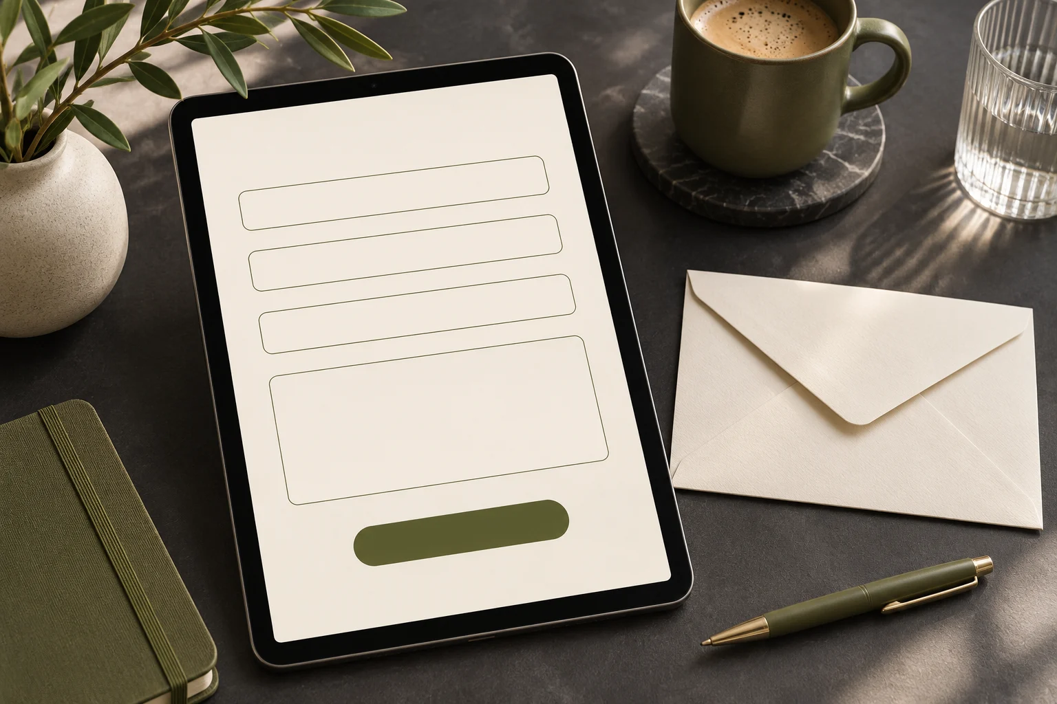
Place the message field and submit button after the questions, then provide a short explanation of how the enquiry information will be used and a link to the relevant notice. If the email address is invalid, explain the problem next to that field and leave the message intact. When testing, check that the person replying can distinguish a real enquiry from a duplicate or spam message. Review the questions if the team repeatedly needs to ask for the same missing detail.
A quick accessibility check
Ask someone unfamiliar with the form to explain each question before they enter information. Then try moving through it using only a keyboard and check that labels remain visible while values are entered. If an error is shown, can the person identify which field needs attention without relying solely on colour? Follow that with a permitted end-to-end test to confirm the message reaches the right person. These checks reveal different problems: a clear form can still fail to deliver, and a delivered form can still be difficult to complete.